Colonial Addition Designed with Light
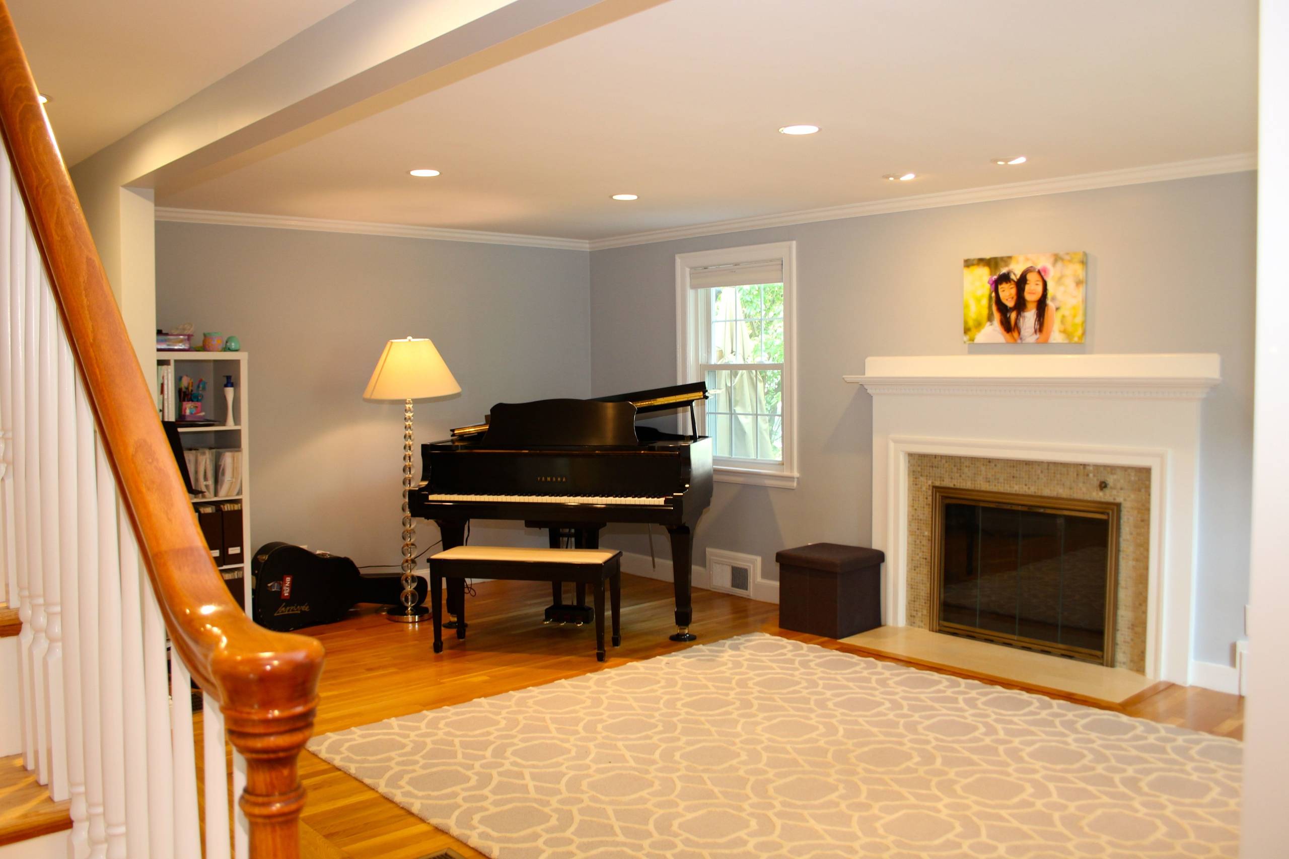
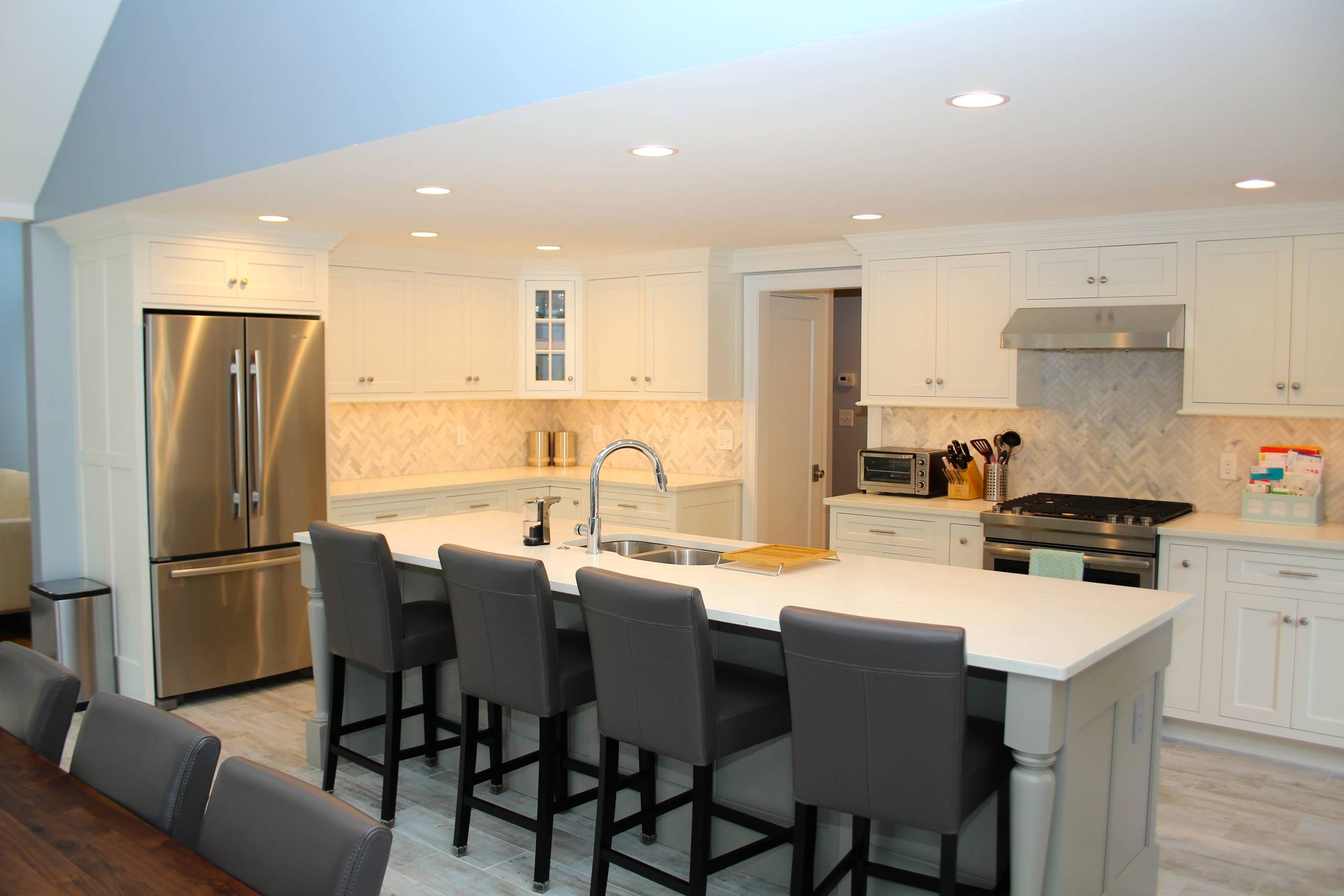
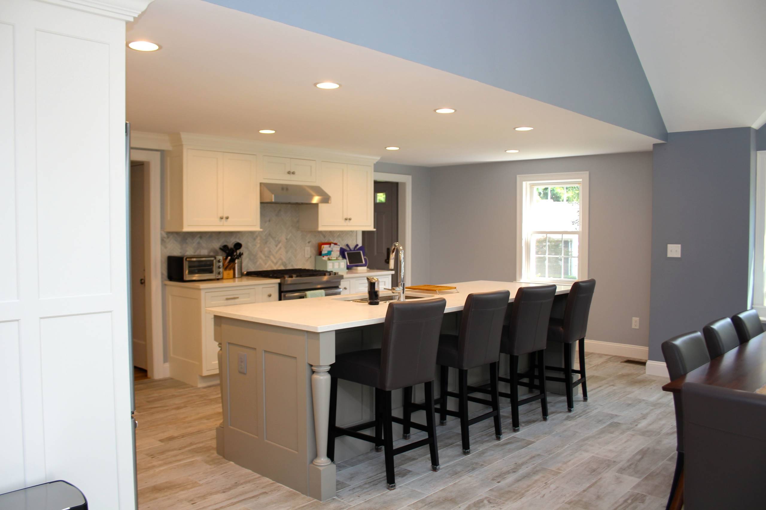
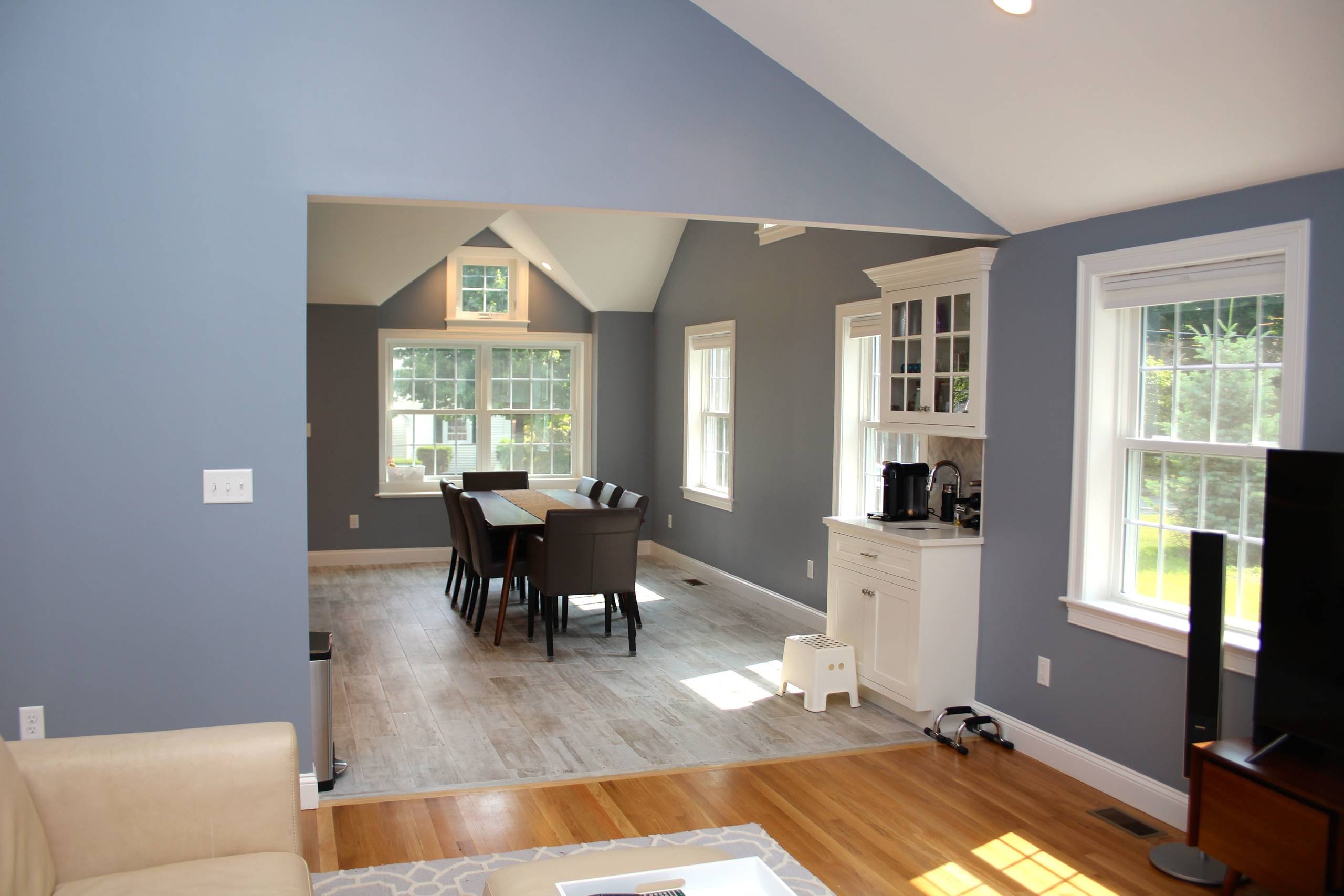
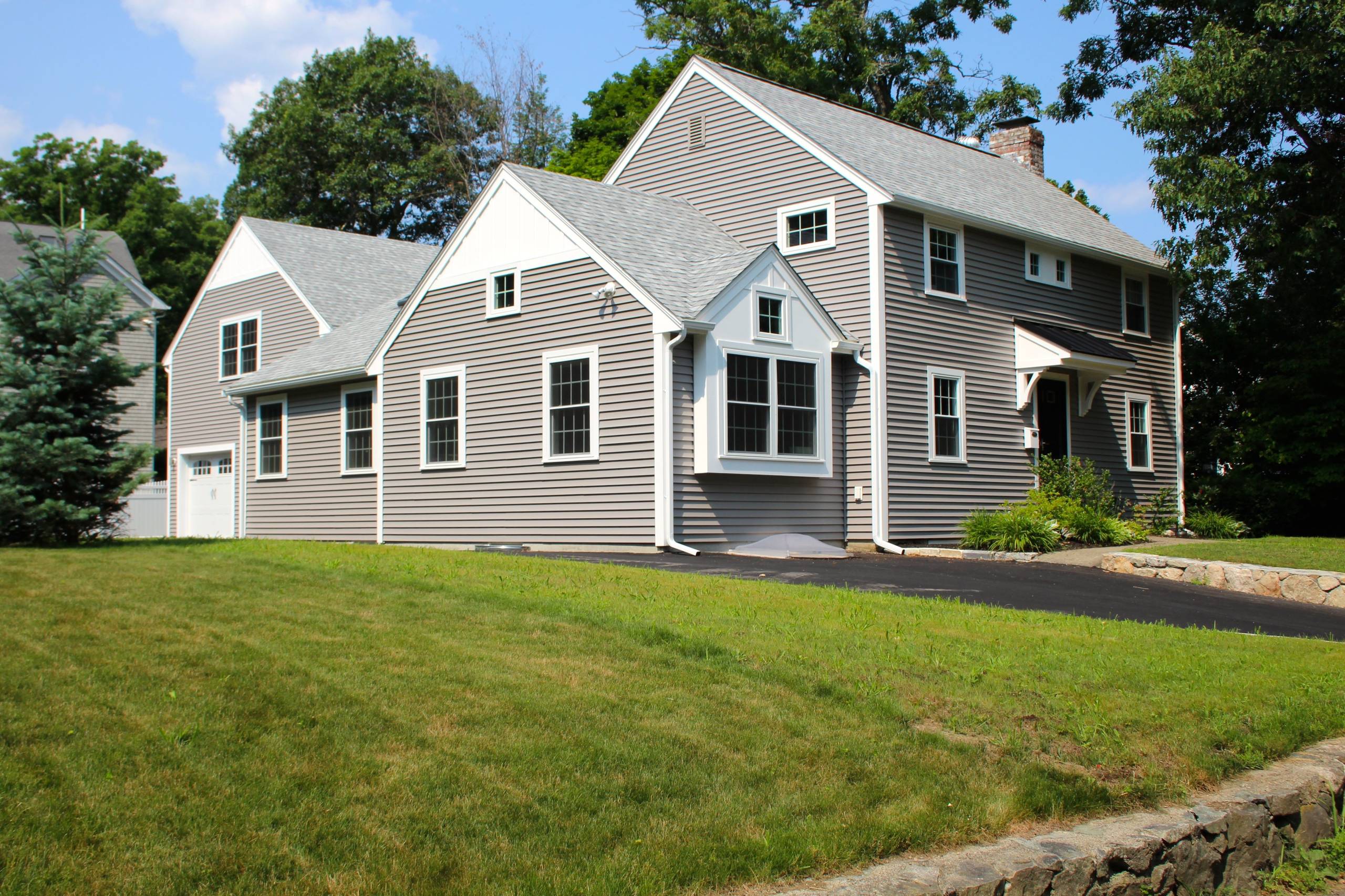
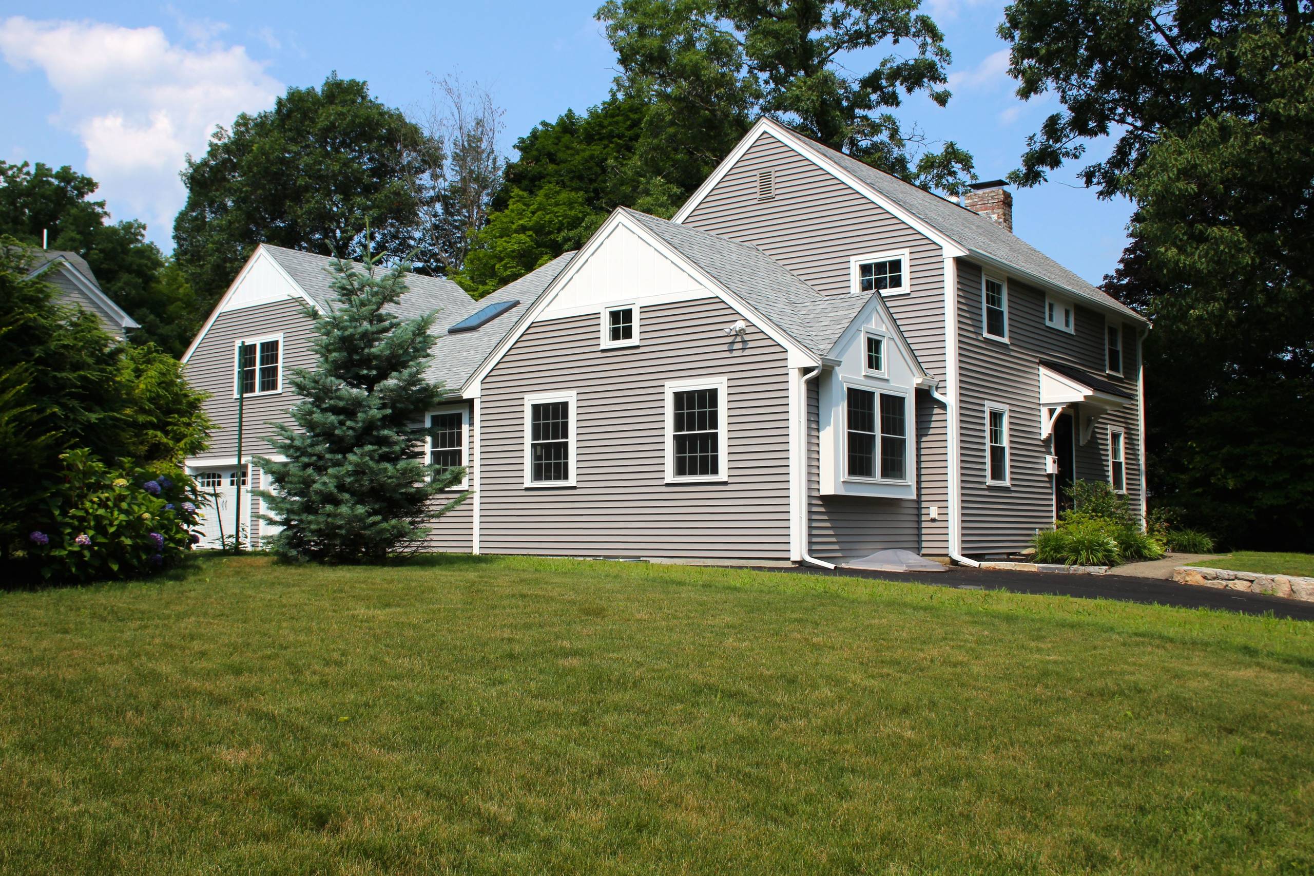
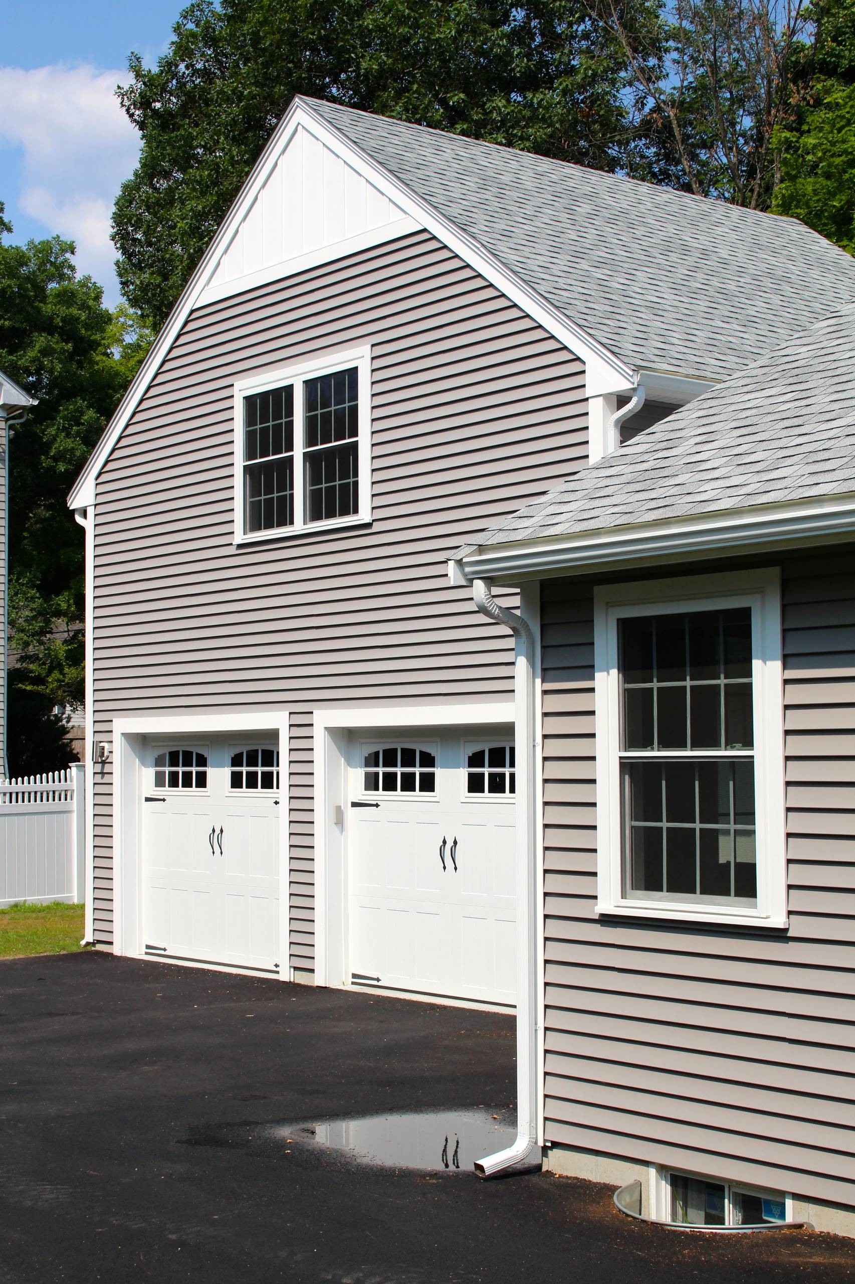
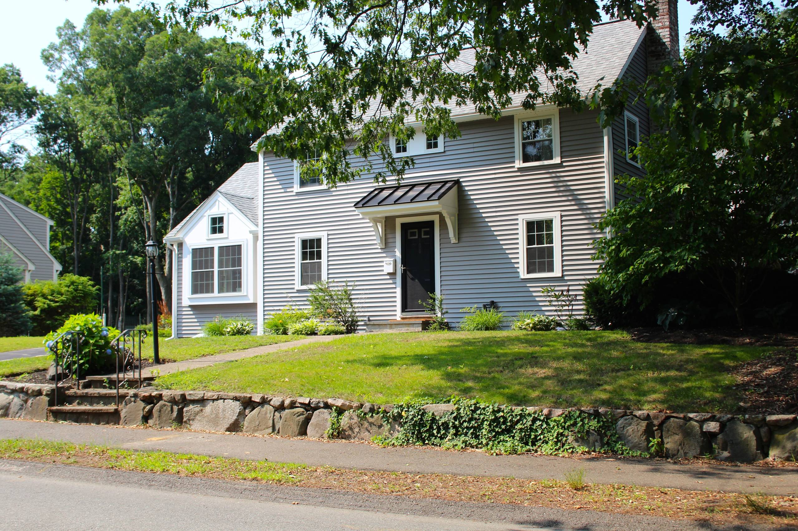
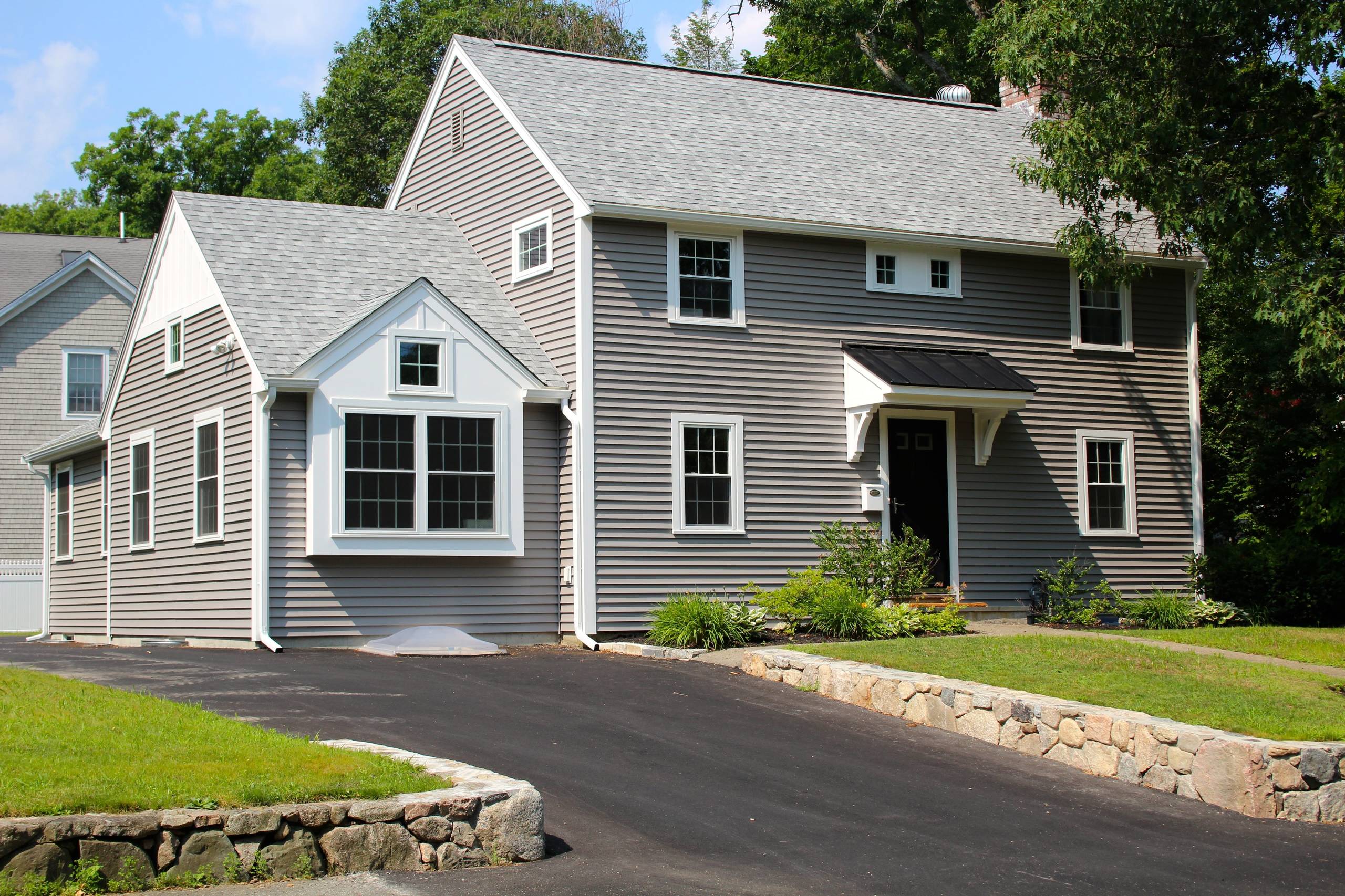
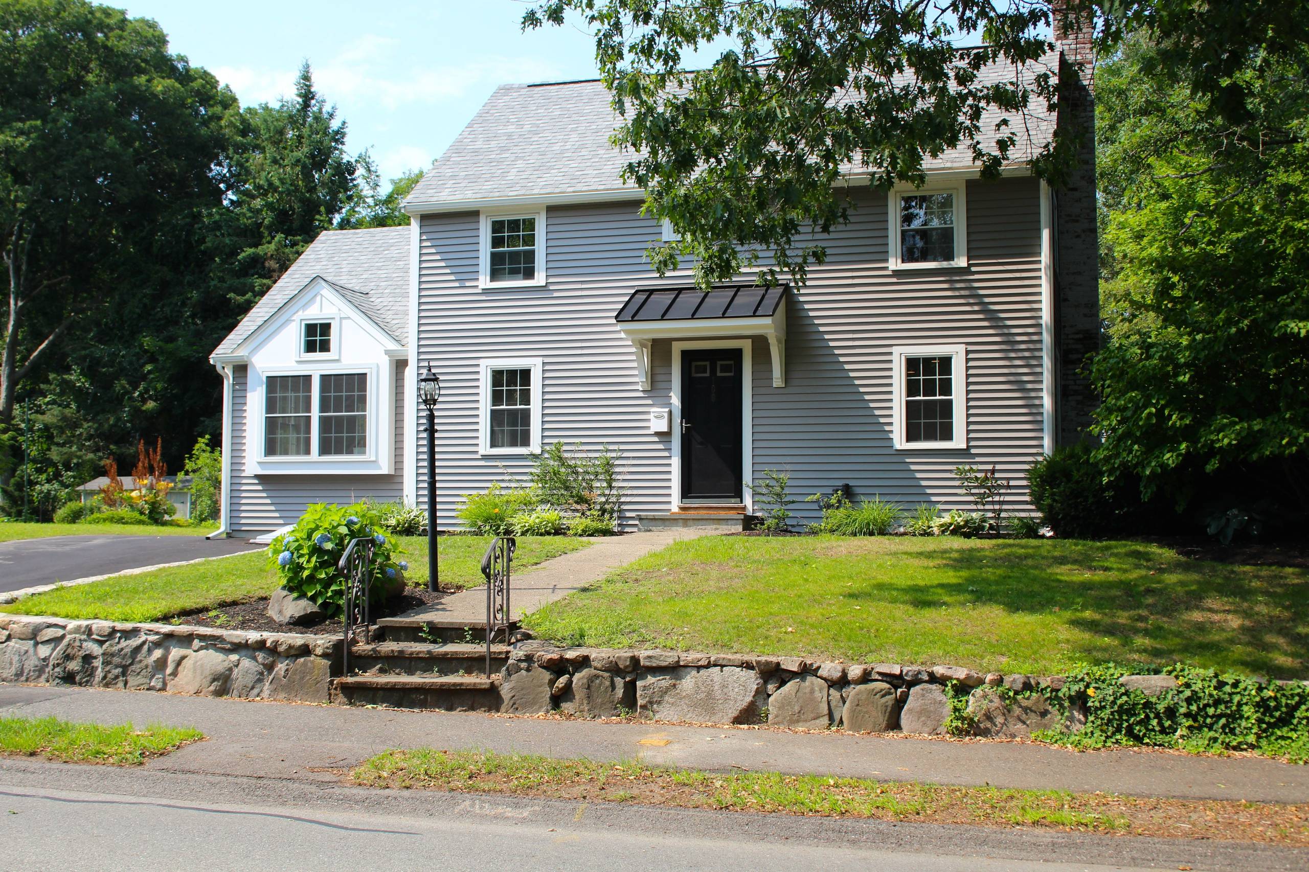
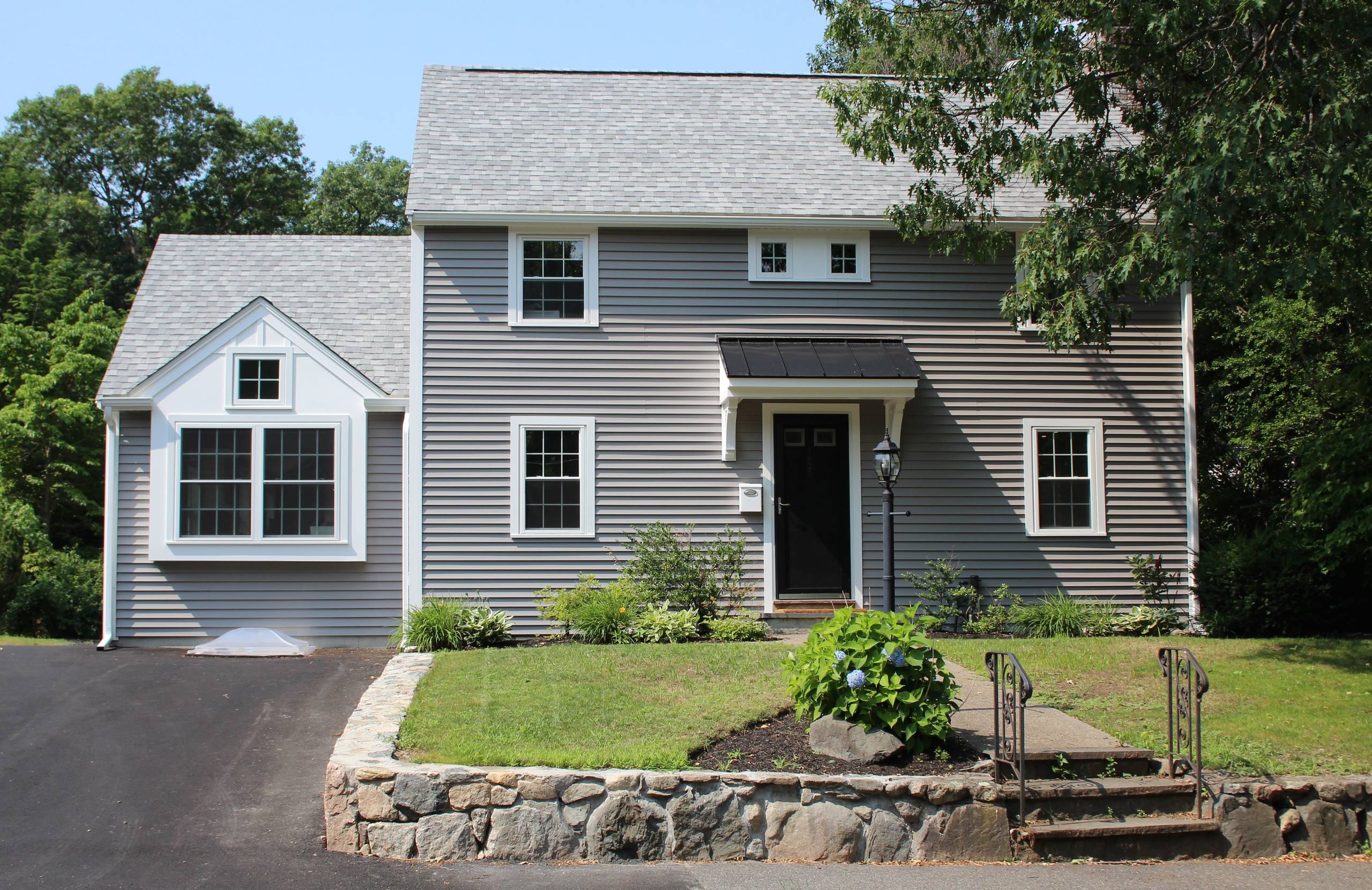
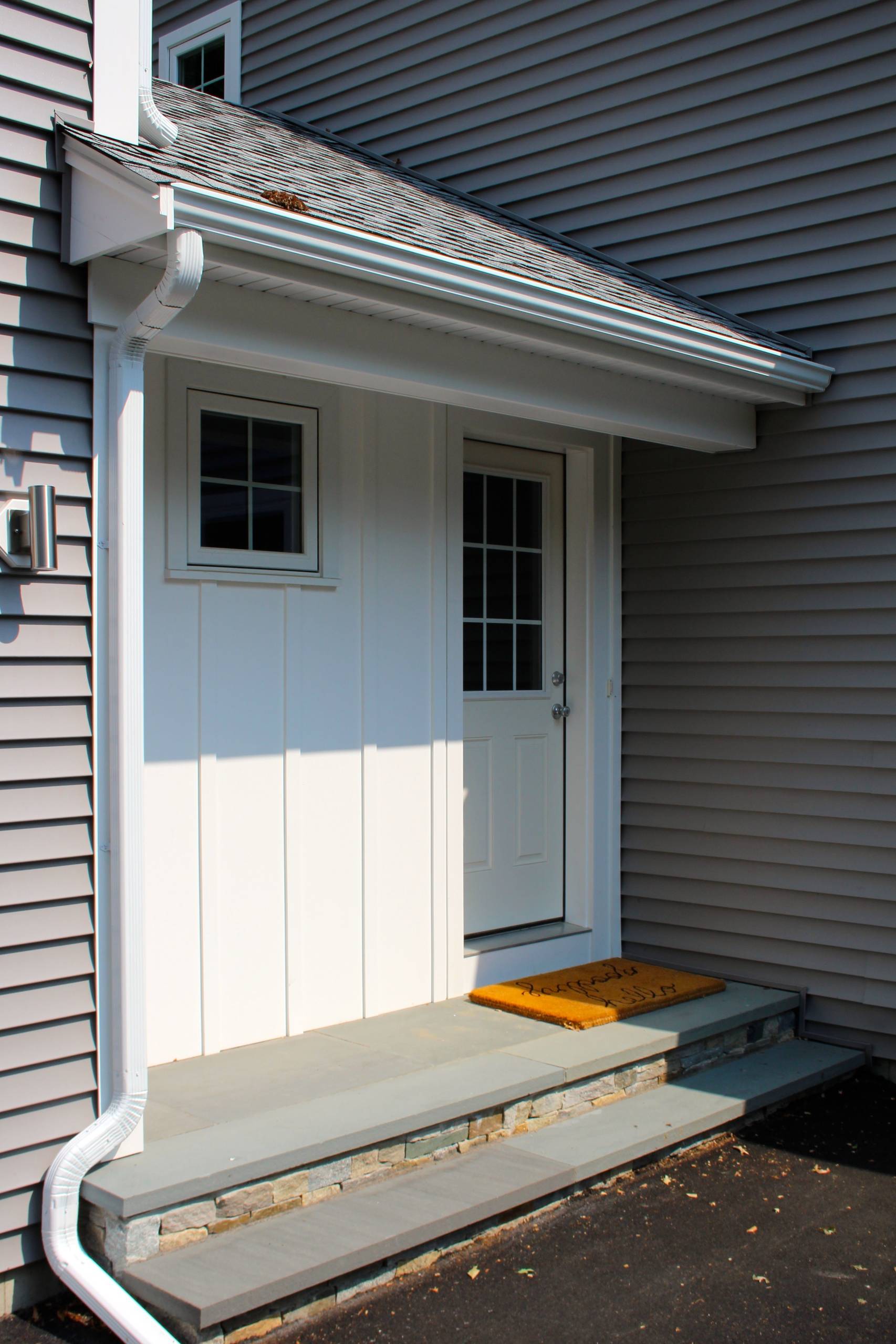
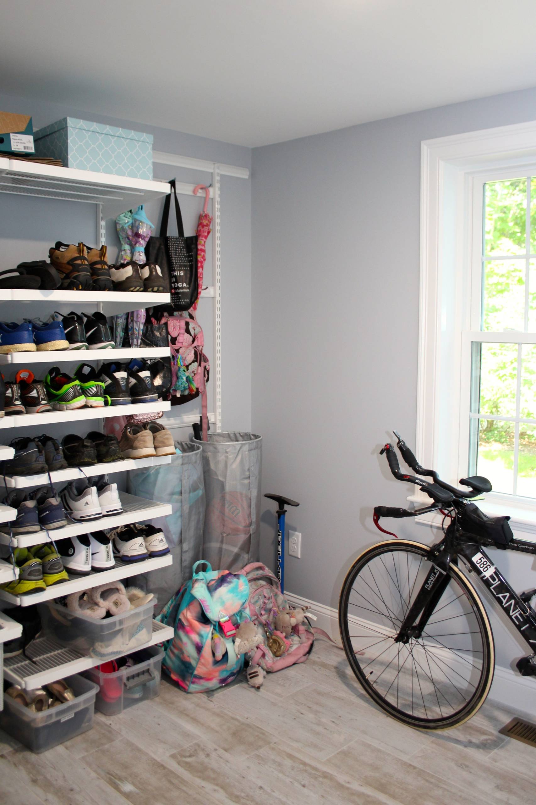
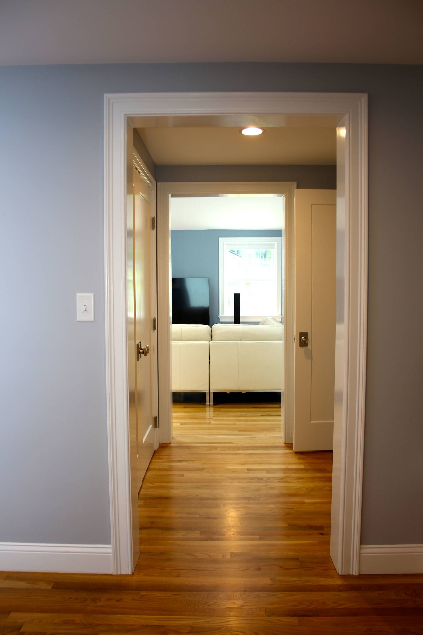
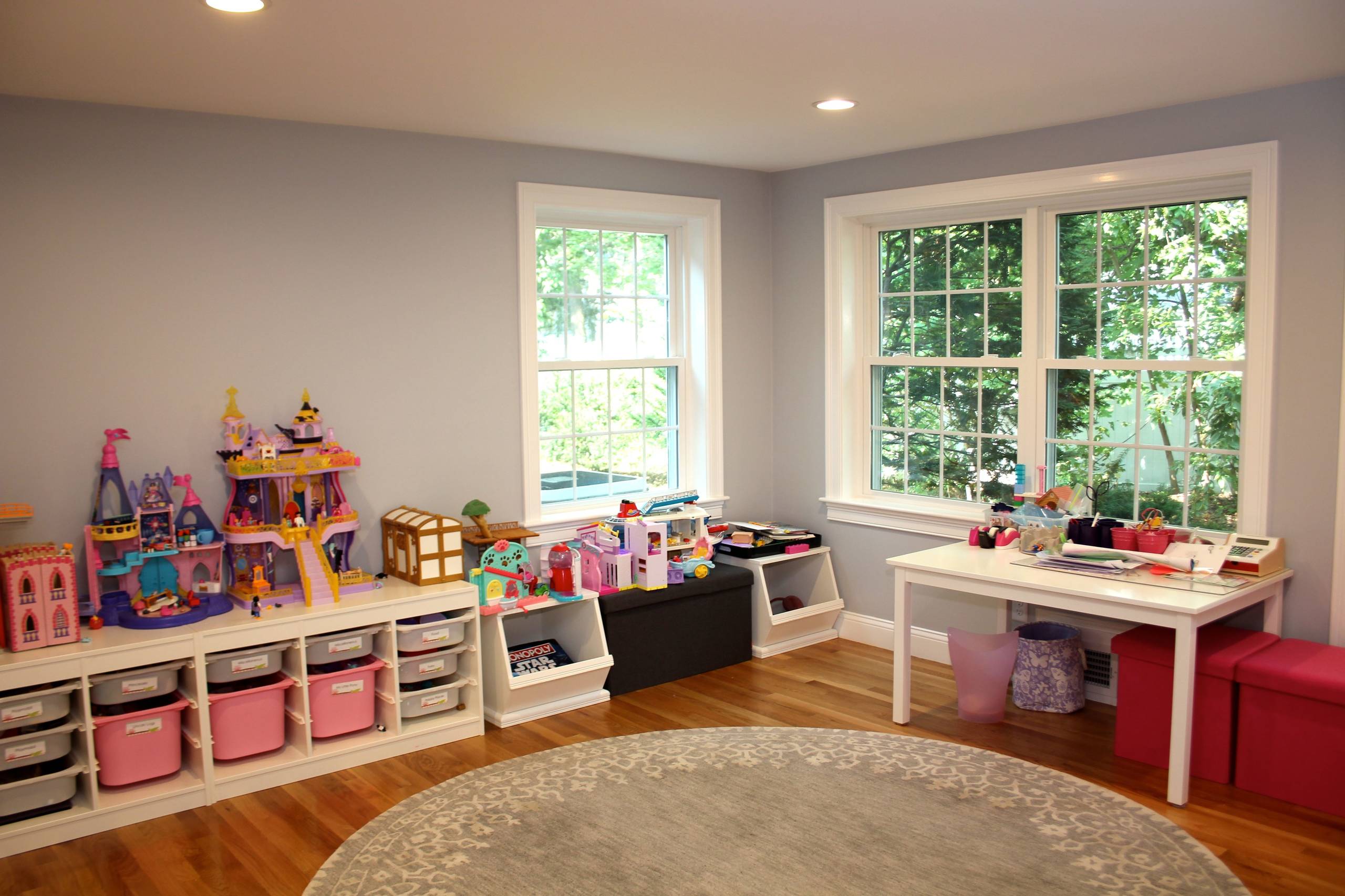
This renovated home boasts a series of additions that steps back and raises up to create a family-friendly and zoning compliant solution. It is a very post-modern design concept in that each small “pavilion” addition has a single use inside it. One pavilion is the kitchen while the next is the dining room and still another is the family room followed by the mudroom and garage. Together they create an assembly of spaces, each with a unique function, footprint and ceiling design. The common motif here is the light that pulls you through each space.
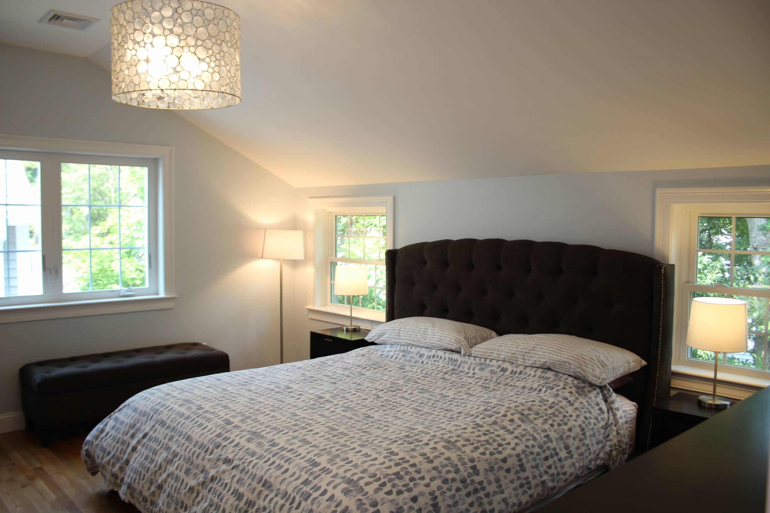
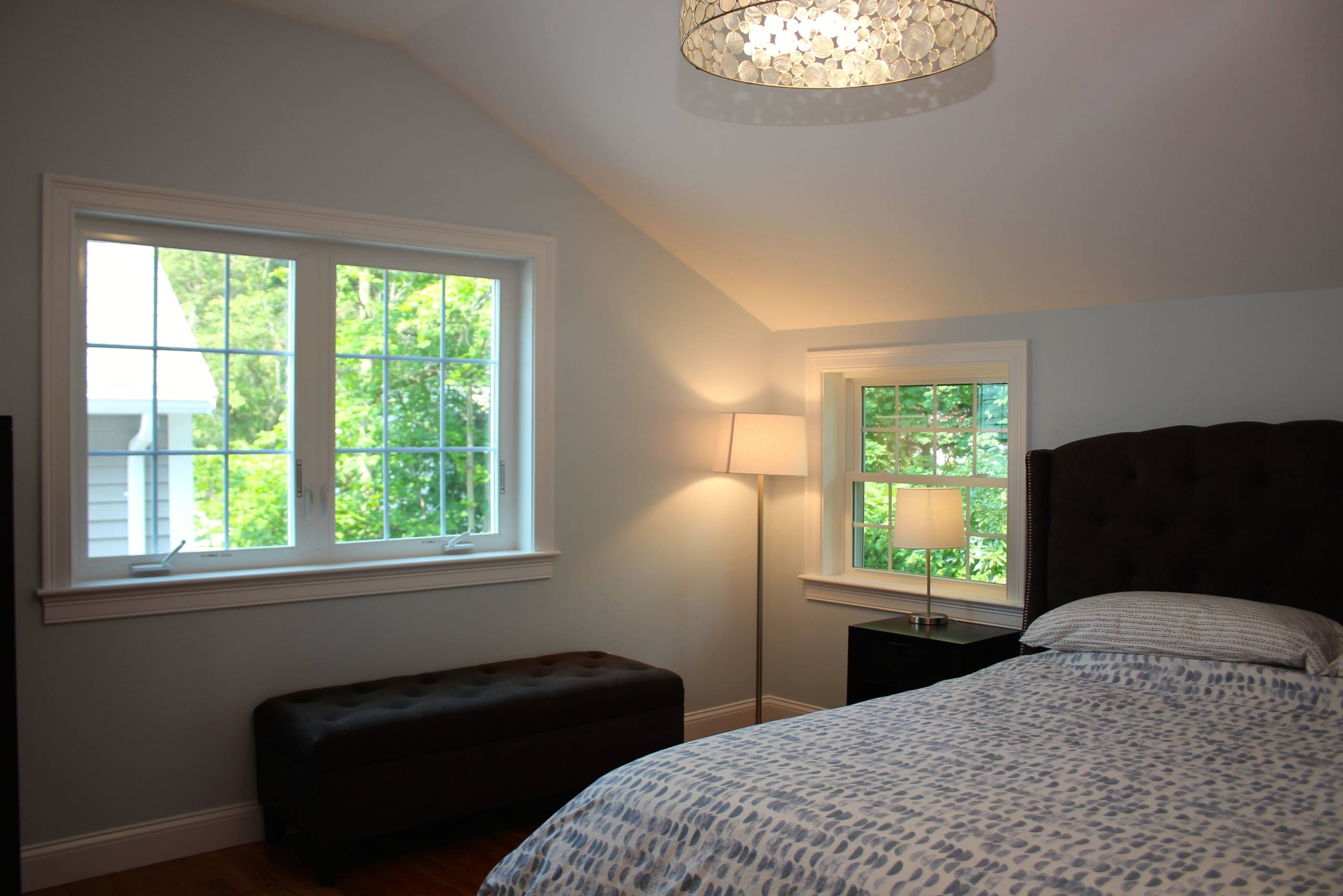
Physically, it is the ceiling that sets the “feel” for each space. Cathedral and flat ceilings with layers of lighting and subtle color shifts make it a comfortable, warm interior and a true art “experience”. Both natural and artificial lighting take turns over the course of the day to illuminate and animate the spaces and the functions in each space.
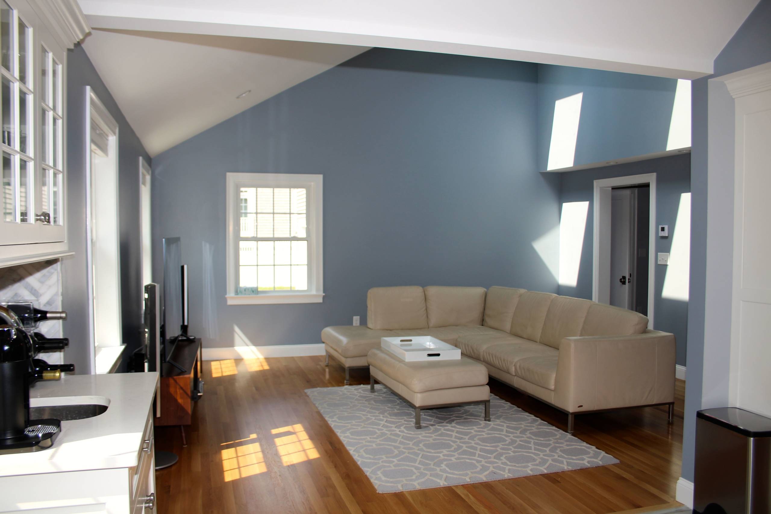
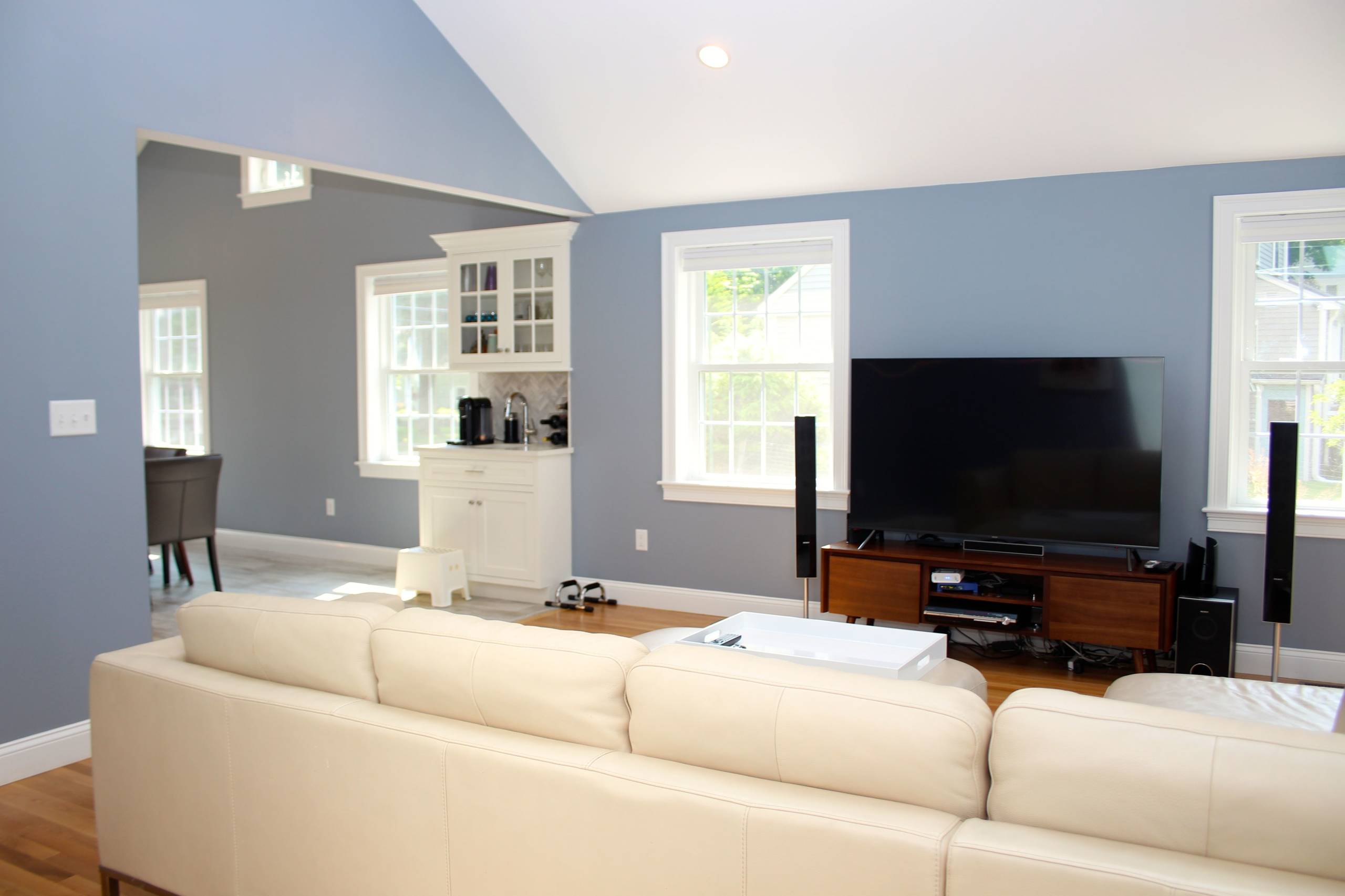
In the family room, a tall vaulted shed roof above has two skylights positioned close to the high interior wall. The southern exposure here allows the sunlight to pass through the roof skylight and onto the adjacent wall before bouncing it onto the interior space below. This is the proper use of skylights. All too often skylights are positioned in the center of the roof allowing sunlight to project down onto floors, causing uncomfortable solar heat gain and glare. The bounce of light through the skylight is paramount.
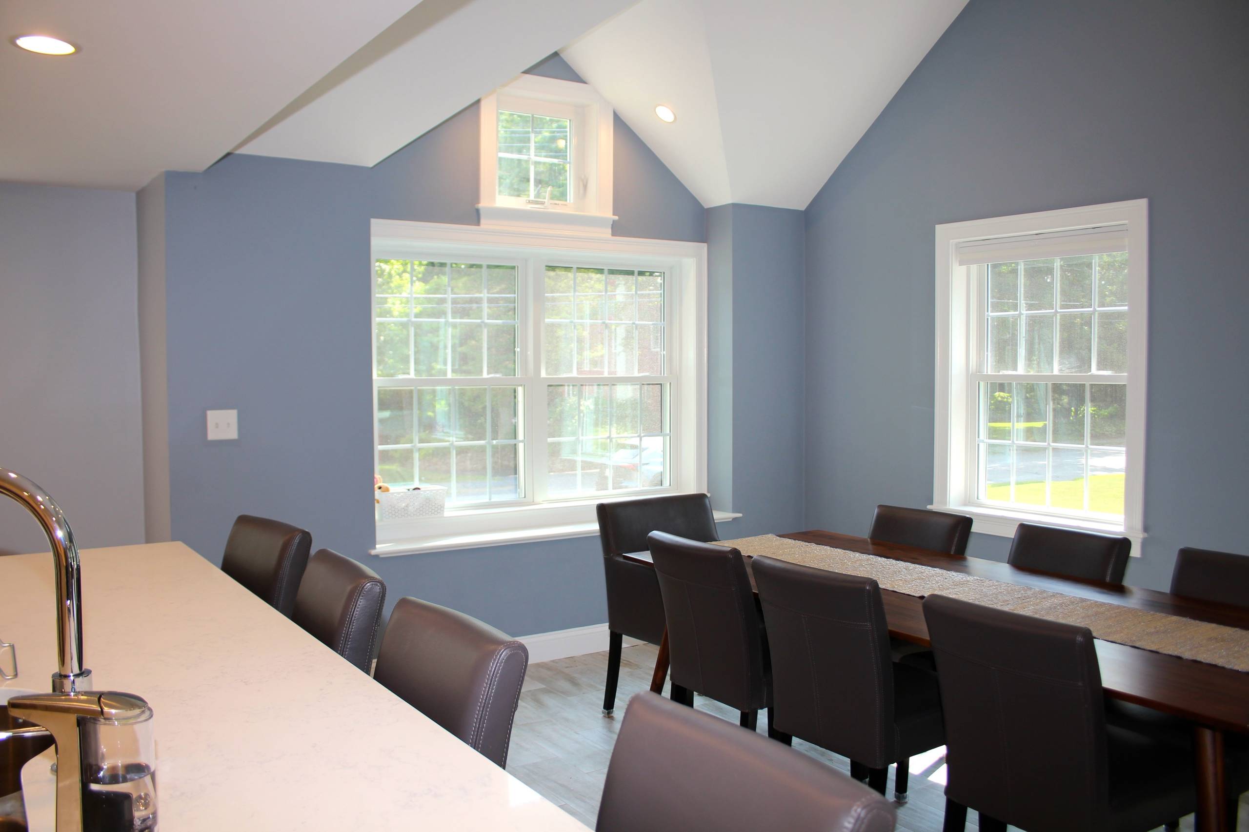
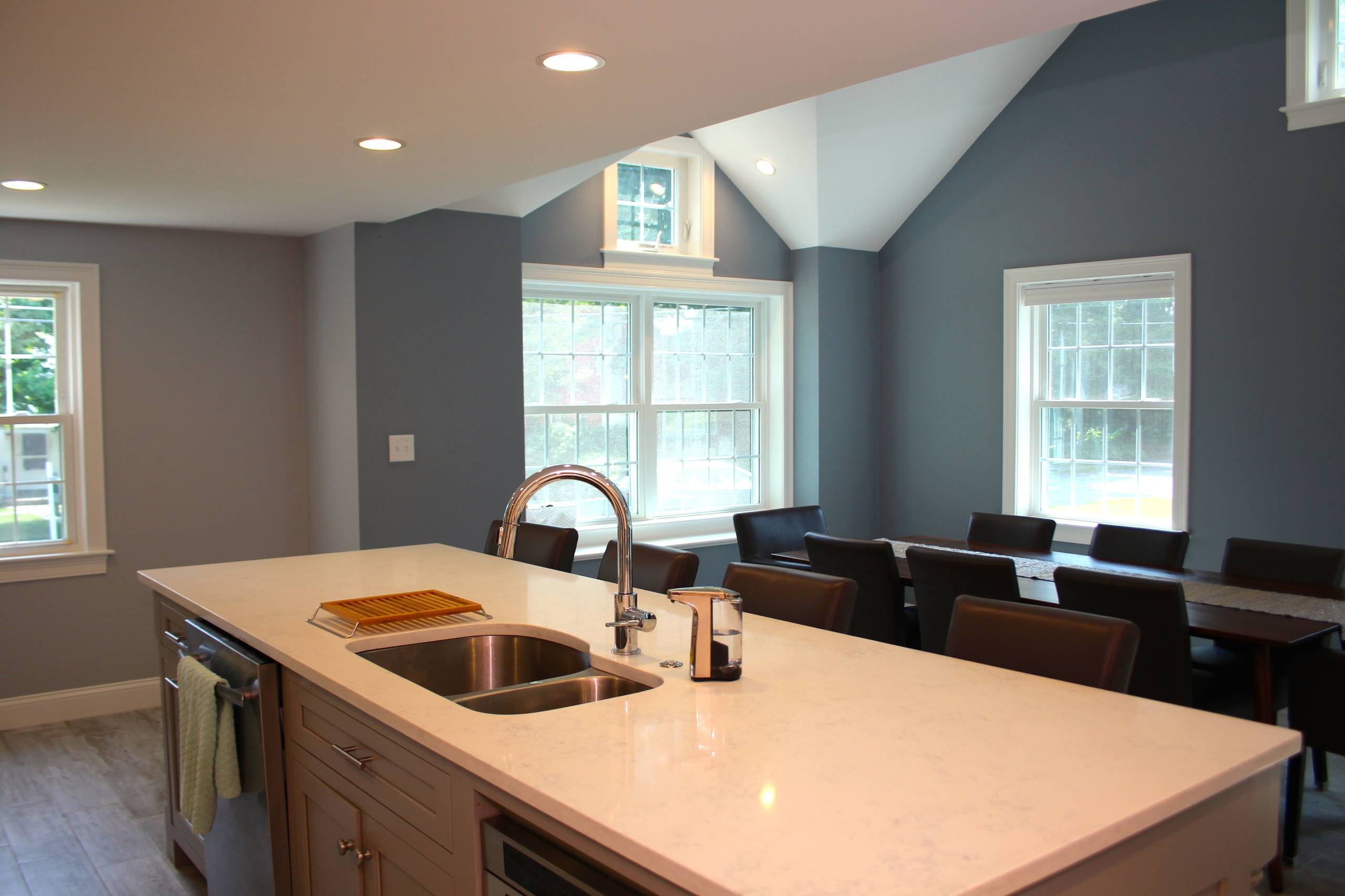
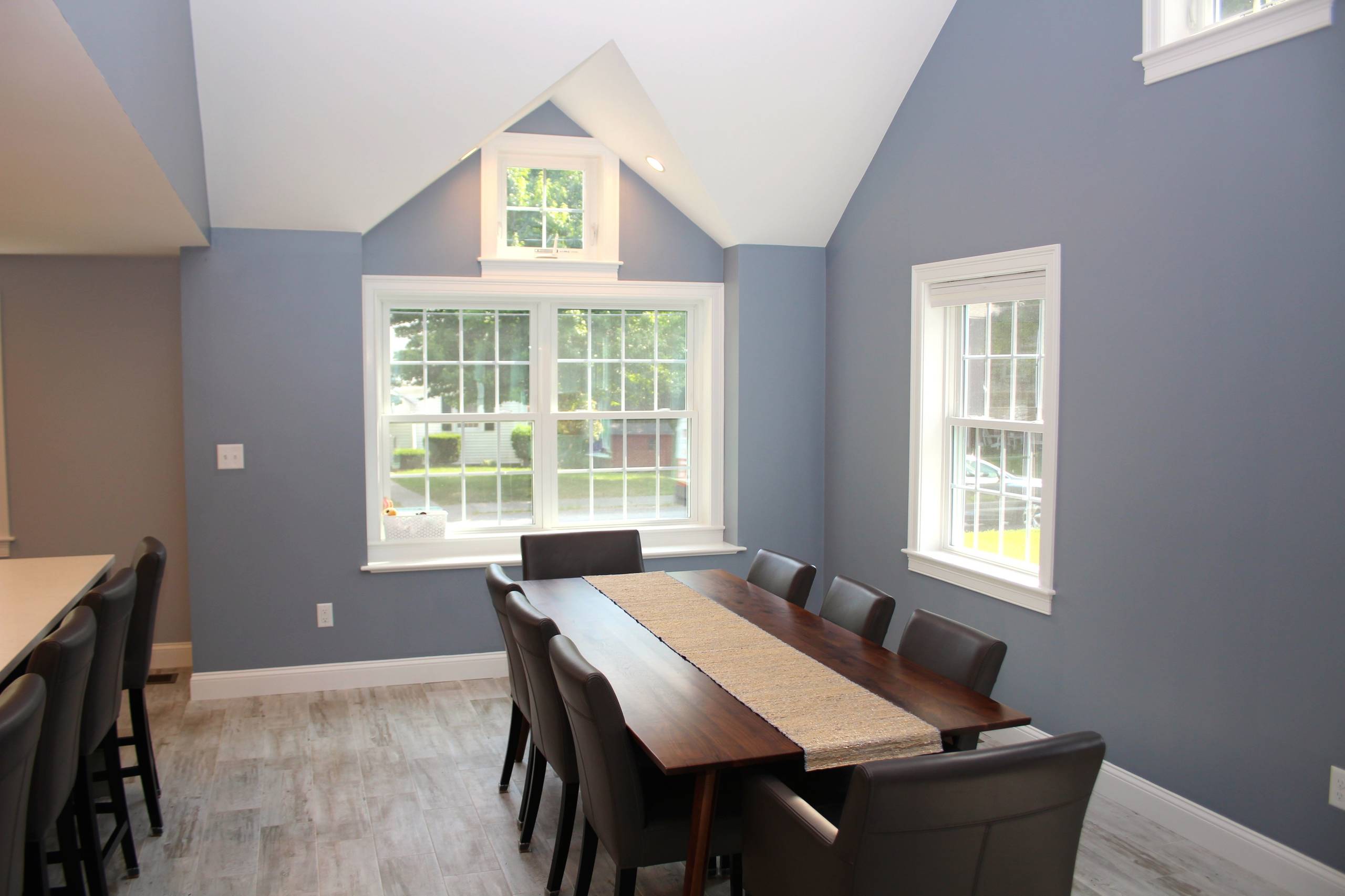
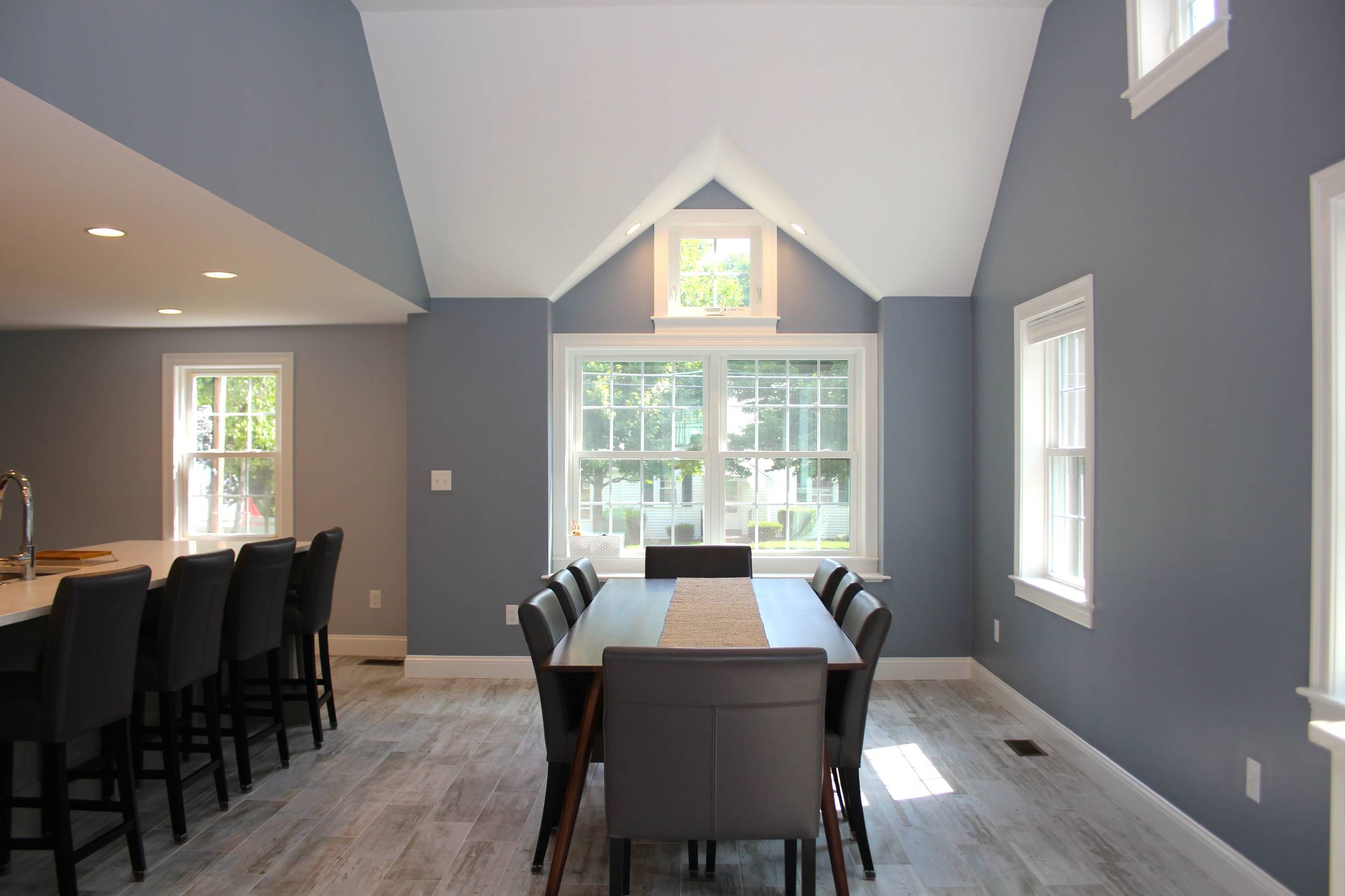
In the dining room an eastern facing box bay dormer window is positioned for morning light to enter at the low sunrise angle and also bounce around the deep jambs of the bay. This too allows for a peaceful dose of morning light. Just the right way to start your day.
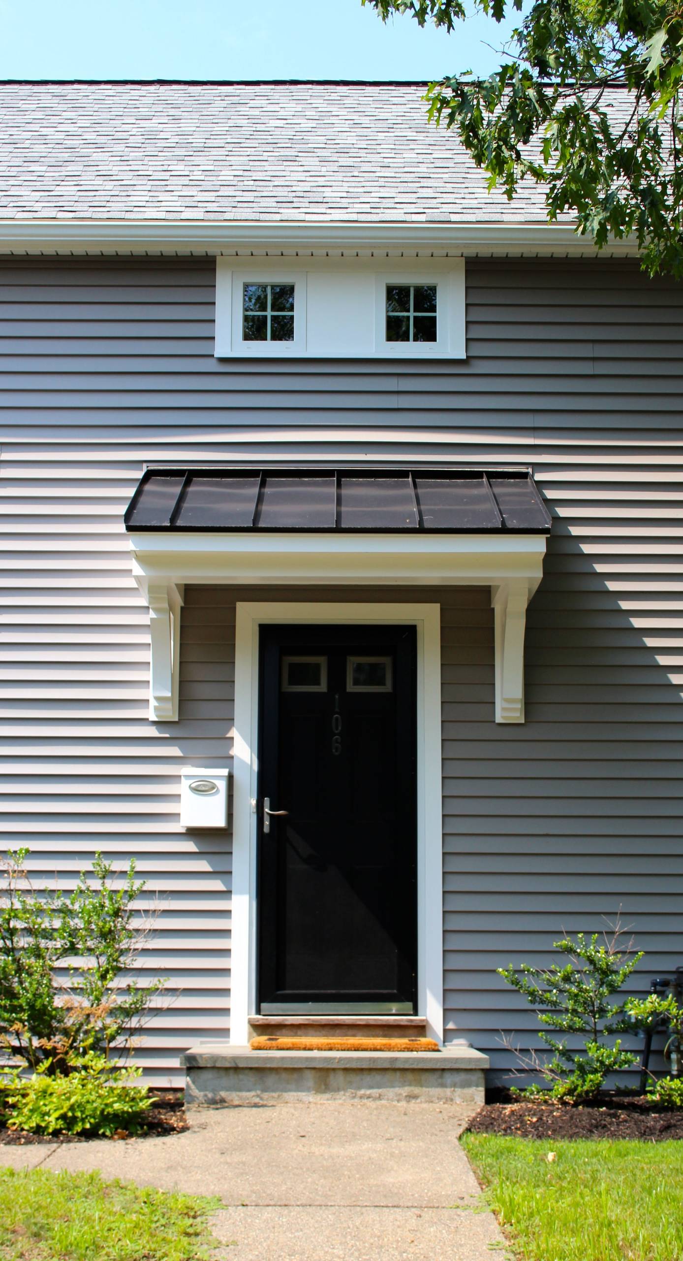
In this home, windows have become the “art” of the walls: framing views of light entering the interior and illuminating spaces while establishing room “centers” and organizing the axis of interior paths. Looking from one “room” to the next, this natural light pulls you to the next space. So, after the tour, sit, relax and start bouncing some ideas around about making your own space more illuminating.


Colonial Addition Designed with Light
